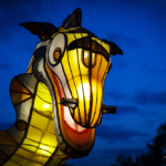
Malahang Lantern Festival
Posted 18th June 2021
1 comment
The Malahang Lantern Festival was a delightful and free family-friendly event in Melbourne’s north-east featuring dozens of beautiful lanterns showcasing a variety of themes.
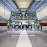
Canberra Airport
Posted 25th October 2016
No comments
A photographic stroll through the beautiful interiors of Canberra’s $480 million international airport.
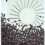
Australian Grains Genebank: An artistic response
Posted 16th August 2016
No comments
“Australian Grains Genebank – An artistic response” is now showing at the Centre for AgriBioscience as part of National Science Week.
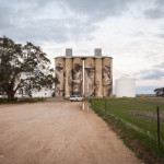
Brim Silos
Posted 2nd July 2016
2 comments
Travelling into western Victoria, I finally had the chance to see the nationally famous painted silos in the small town of Brim.

The decline of handwriting
Posted 9th December 2015
3 comments
In an era when computerisation has found a way into so many parts of my life, I wonder whether my handwriting has suffered as a consequence?