Challenges in recasting the net
I have just redesigned the look of my website from scratch, but there were many challenges in the process.
After more than five years, my personal website has had a major design overhaul. Yet coming up with a brand new design from scratch and implementing that design is no easy task. Here’s the story of how it all began.
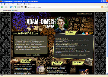
By late last year, I’d decided that my website (http://www.adonline.id.au) was looking tired. Designed five years ago with minimal adjustment, the website was starting to have the same aesthetic appeal as a bunch of 1960’s cream-brick flats. So it was time for a refurb!
The first questions I had to ask myself related to the purpose of the website and what I wanted it to convey. Blogging and photography are now major components compared to five years ago, and so the new design had to reflect this. And I wanted to re-establish the personal aspect of the website. Aside from its outdated appearance, I felt the old design looked too corporate.
Graphic design is not an easy thing to master. There is a philosophy behind the art, especially in an application like this. How could I create something unique and eye-grabbing and contemporary from scratch? I noticed that two distinct graphic trends have been emerging in Australia that have caught my eye; both on the internet and on television and billboard advertising. These are the “Web 2.0” look, and the “Grunge” look.
The Web 2.0 look features clean white spaces with lots of those shiny, coloured and glossy buttons and rounded corners galore. Apple probably started this off with their iMac advertising a few years ago but it seems it has infected the web like the Plague, most notably in the blogosphere. This is not a bad thing. In fact, Web 2.0 can be really cheery with its use of bright colours, but I felt that it was still too “corporate” for what I wanted. That said, I did want a design that emphasised the participatory and interactive elements of my website such as RSS feeds and commenting that Web 2.0 sells so well.
The alternative that I was attracted to was almost the complete opposite to Web 2.0 in terms of its presentation, that being the Grunge look.
Grunge design is typically characterised by rough elements, darker colours, and lots of intricate detail right across the browser screen. The Grunge look often incorporates use of classical or Victorian-era elements such as floral swirls and motifs. The style permits much more personalisation than the Web 2.0 look but still allowed some emphasis of the interactive features my site has to offer.
Grunge met all my criteria; it was interactive, contemporary but personal. Of course settling on a design style and then developing it into a website are two different matters and Grunge is a real challenge in that regard.
The Web 2.0 look is relatively easy to implement within the restrictions of tables-based HTML. Grunge, on the other hand poses massive problems with its graphics-intensive style and angled elements. I had to plan the new site very carefully to consider these factors.
The practical elements of the website are as critical as the aesthetic. I chose Grunge in the knowledge that some users with slow dial-up accounts would have to wait quite some time to see the content (up to 50 seconds). I decided that broadband is the way of the future, and at some point one has to accept that some people will drop off the wagon as technology changes. Most other corporate websites would be horribly slow for dial-up users by now, so what difference would my site make?
I created the basic graphical interface with Ulead PhotoImpact which is basically the same as Adobe Photoshop, but cheaper. Using layers, I was able to play with the graphic elements and try different colours and combinations before finalising the design. I then had to chop my graphic into tiny little pieces to create the website.
This whole process took weeks in between everything else in my life. I had planned to have the new look implemented by Christmas 2007, but as always a redesign of my website is a relatively low priority in the grand scheme of things.
Once the design was completed and the web templates created, I had to transfer all the old content across to the new design, and make sure there were no remnants of the old website remaining. This included customising Error 404 pages and the like. Pages that contain dynamic content (such as search engine results) were especially difficult in this regard.
But by yesterday evening, all had been finalised and the site was ready to go!
I am happy with the new design. Whilst it is a major departure from the previous, I feel it is a significant improvement and better reflects the aims and scope of the site. Most importantly, I hope the design lasts a few years so that I don’t need to go through this whole process again too quickly!
Comments
2 responses to “Challenges in recasting the net”
I like it Adam, you’ve done a great job, the new site looks great. Love reading the interesting architecture articles and the photography. Keep it up !
Thanks Sean. Glad you like the new website!