Unconventional architecture at the Convention Centre
The beautiful orange interior of the Melbourne Convention Centre impresses.
This week, I have been attending the OzBio 2010 conference at the Melbourne Convention and Exhibition Centre, and have been utterly impressed with the striking architecture of the new Melbourne Convention Centre component.
The Melbourne Convention and Exhibition Centre is Victoria’s largest convention centre. The first component of the complex (the “Exhibition Centre”) was built in 1995 and is colloquially known as Jeff’s Shed, so named on account of its unappealing exterior and the controversial Premier who abandoned plans for a museum in favour of a conference venue.
The newer component (the “Convention Centre”) was completed in 2009 and cost a reported $1 billion to construct. For that price, one should expect some decent architecture and I am pleased to report that the venue delivered.
As I walked in, I was immediately impressed.
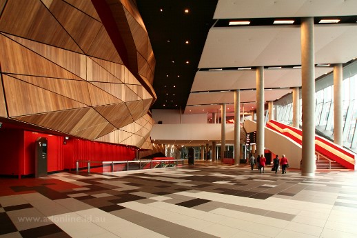
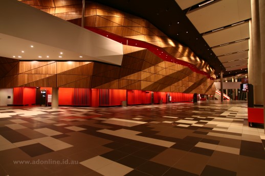
Somewhat boldly, vivid orange has been used to colour the walls on one side of the foyer. Complimenting that is a timber-clad ‘edifice’ which forms the basis of the mezzanine above. Aside from the orange walls on one side, the only other colour comes from the steps which are also orange, making them very easy to locate. Muted tones are used across the rest of the space, and a large floor-to-ceiling window provides ample natural light as well as a view to the Yarra River.
The orange of the foyer hints at what lies upstairs. Making one’s way to the mezzanine above, the walls, floors and ceiling are coloured in the same vivid orange. So whilst it sounds absolutely hideous, it works exceptionally well. I think the boldness of the colours work where a more restrained application of colour would have seemed almost tokenistic.

Clearly the architects and interior designers don’t want to over-do it, so only the mezzanine uses such a rich colour scheme.
Of course, the centrepiece of the Melbourne Convention Centre is the 5000-seat auditorium, which can be divided into acoustically-independent smaller sections. The auditorium is beautifully fitted out with comfortable chairs in various shades of earthy green reflecting the colours of the Australian bush. The upper walls and ceiling are clad in timber. As would be appropriate in such a venue, the designers have steered away from vivid colour in a space where people need to feel comfortable but can also concentrate on the speakers or performance.
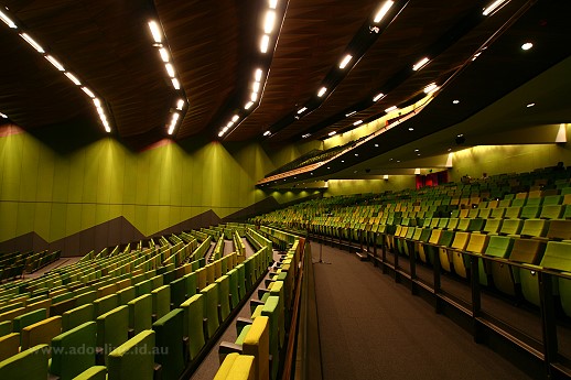
In terms of utility, the stage can be clearly seen from all sections of the auditorium and for the purposes of a scientific convention, the acoustics were good. (I cannot comment about its suitability for musical performances or other applications).
I have just two criticisms about the design of this building.
My first criticism relates to the entrance, or rather the section that joins it to the older “exhibition centre”. This space is pierced from the posts supporting the balcony of the older building. I find the entrance narrow and pokey, but perhaps this was the intention of the architect but I don’t think it works well.
My other criticism is of the meeting rooms which, whilst comfortable, are aesthetically bland – a disappointment after experiencing the impressive design elsewhere!

The mezzanine (right) with foyer below.
The Melbourne Convention Centre was designed by Woods Bagot and NHArchitecture and built by a consortium led by Brookfield Multiplex and Plenary Group. The centre has a 6-star rating and has won multiple architectural awards. Deservedly so, in my opinion!
Great architecture makes for a great venue, so I am pleased that I have now had the opportunity to see the inside of Melbourne’s newest conference venue.
Comments
2 responses to “Unconventional architecture at the Convention Centre”
Cool architecture! Would love to go in one day and take a look.
Speaking of referring to your blog, I looked up this entry to check out the seating arrangements of the auditorium (is it called The Plenary?) before booking tickets for a show! 🙂