The life of the Victorian Government logo
I’m always interested to see how the Victorian Government logo changes with each new government.
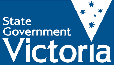
At the last Victorian state election on 29 November 2014, Dennis Naphine’s Liberal/National coalition was thrown out of office and replaced by Daniel Andrews and the ALP. After taking office, the new government arranged for changes to be made to the government’s logo. These revisions were published in interim form yesterday.
As a Victorian with a keen eye for design, I’m always curious to see how the logo evolves with government over time.
The Victorian Government logo is distinct from the coat-of-arms. Unlike the coat-of-arms which is only used in certain formal situations, the logo is used as a broader branding device for government. A version of the logo was first employed in 1993 and has since taken on a life of its own, appearing on stationery, signage and beside department names in both print and online through multiple governments. The official colour for the logo is Pantone® 541 (or RBG 0-51-102).
Look carefully, for the changes are slight in the newest version but an attentive eye will observe the subtle adjustment that has been made to the size and position of the words “State” and “Government”.

Victorians will soon see this newer version replace the previous one on government communications.
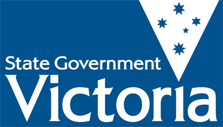
The One Before: 2010-2015
This is the immediate past version of the logo which came into use following the 2010 election when Ted Ballieu’s Liberal/National coalition made adjustments to an even older logo by inserting the words “State Government” and removing the slogan.

This version is now going to be phased out but its use is currently widespread across government.
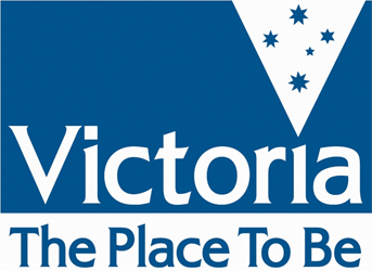
The Place to Be: 2002-2010
In 1999, Steve Bracks won government for the ALP. In a symbolic gesture a new logo was launched in 2002 which ultimately formed the basis of the subsequent two designs. A competition was held to decide upon a new motto which was placed below it.

For the next eight years, the ‘Place to Be’ version appeared on government stationery, vehicles, signage and the like. The Ballieu government ordered its removal in 2010 but traces of it remain.
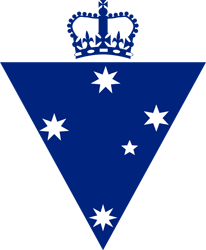
The first logo: 1993-1999
The first logo was employed by the Kennett Liberal government and was famously accompanied by the slogan “On the Move”. The logo was blue in colour and featured the Southern Cross within a triangle and a crown above. The triangle and Southern Cross have become a lasting feature, having endured through four versions.

In a more formal context, the words “State Government of Victoria” were displayed below the logo in a single line of text.
Disclaimer
These views are my own, and do not represent the views of my employer.
Comments
2 responses to “The life of the Victorian Government logo”
Very interesting, and shows how unobservant I am, as I had not noted the subtle differences.
Generally people would not notice any difference, but it is all about how it appears now to voters.