The new-look Flickr: Pros and Cons
I love the new-look Flickr but there’s still some room for improvement to make the site truly “awesome”.
A couple of weeks ago, global photo-sharing website Flickr launched a brand new look and introduced some significant changes to their paid account offerings.
The changes have been controversial (and overshadowed by Yahoo’s purchase of Tumblr) but nevertheless, I thought I’d comment about my favourite social media website now that I have had a chance to inspect the changes for myself.
Back in January 2012, I wrote a lengthy blog post about Flickr’s deficiencies. My biggest gripes were that (1) Flickr’s front page didn’t do its job, (2) that the mapping feature was woefully inadequate, (3) that the social aspect of the site needed modernising and (4) that I was concerned that Facebook and Google Plus were taking Flickr’s customer base.
Now that the website has completely re-launched, I thought it may be an opportune time to review where Flickr has been in the last 18 months as well as take a look at the new plans on offer.
1. The new plans
I thought I’d deal with this issue first because this has caused the greatest amount of confusion and concern amongst users. I don’t blame them, either.
I am a ‘Pro’ user from way back and I confess to being rather alarmed when I read about Flickr’s new plan structure. It seemed that Flickr was trying to force us to either pay US$50 rather than US$25 for an inferior product or lose features and take a ‘Free’ account. Thankfully this isn’t the case, but that wasn’t immediately apparent and this unhelpful explanation didn’t help. They have now clarified matters.
I have provided a thorough summary of the various plan options on my Coding Blog, but these have been summarised in tabular form below.
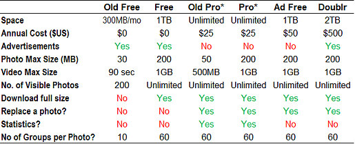
The ‘Pro’ plans (marked *) will be grandfathered for existing users and as of 20 May 2013 are no longer available for sale.
It took me a while to determine what was best for me, especially when Flickr were offering pro rata refunds to Flickr Pro users as an incentive to downgrade to a ‘Free’ account. Having reviewed the available information, I am comfortable to continue paying US$25 for a ‘Pro’ account as it will ensure I can upload as much as I like, although I doubt that I’d ever exceed the 1 terabyte mark. I will review this in time, depending on other factors, but I admit that there’s not too much difference between a grandfathered ‘Pro’ account and the new ‘Free’.
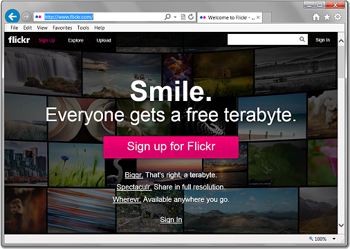
2. The new look
Welcome to 2013, Flickr. It’s about time!
I have heard complaints but I have to say that in general, I like the new look. Photographs look better on a black background and I prefer the larger format of images – just as any photographer would!
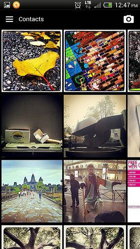
A massive improvement also comes with the ’tiled’ photostream and search result pages, which follow in the footsteps of the ‘contacts’ pages that were upgraded last year. These look really nice, especially when a combination of portrait- and landscape-oriented pictures are combined.
Some users have complained that the new highly graphical Flickr interface makes the site slow. Whilst I have noticed that search results in particular can be somewhat slower to load, photos and photostreams seem to be loading efficiently. In fact, I am quite impressed with the speed given the number of images that will load under certain scenarios. Whilst I am lucky by Australian standards (I am on a 12Mbps connection), I agree with Thomas Hawk who states that site designers can’t always design for the lowest common denominator and people need to make an effort to keep their computer systems up-to-date.
Flickr’s hasn’t entirely taken the route of Responsive Web Design, which I think is a pity only because it makes the website less flexible. Nevertheless individual images will resize to the browser width (down to about 400px) which is really nice. That said, the tendency to hide comments behind a “View X more comments” link is annoying and unnecessary.
The new Uploadr has been upgraded to HTML5 which is a good move, but otherwise maintains most of its functionality from the previous update in 2012.
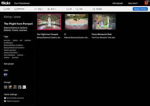
One of the improvements that I would like to see made to the Uploadr is the ability to add images to a map whilst uploading. One can add photos to groups, sets, add tags, captions, titles and even tag people but geotagging has to be completed after uploading.
3. Flickr Android App
Yahoo have released a new Flickr app for Android devices. This is a considerable improvement on the previous version, both in terms of presentation and functionality.
My gripe with the Flickr app is the notifications option, which is set to “on” for all 23 of these options:
- My contact joins Flickr: (1) Contacts from my phone; (2) Facebook friends; (3) Following on Twitter
- Added you as a contact
- Added you to a photo
- Your photo activity: (1) Comment on your photo; (2) Favourite your photo; (3) Added tag to your photo; (4) People added to photo; (5) Comment on your set
- Other photo activity: (1) Comment after you; (2) Only from my contacts; (3) Mention in photo comment; (4) Mention in set comment; (5) Mentioned you in a photo
- Group activity: (1) Invited to join a group; (2) Photo invited to a group; (3) Join request approved; (4) Photo request approved; (5) Join approval needed; (6) Photo approval needed
- Share activity: (1) Shared a set with you; (2) Shared a photo with you
Within minutes of updating the app, my phone started beeping and it immediately became intensely annoying. My recommendation is that a couple of these options be “on” and the rest are “off” by default. Irritating people with too many notifications on their device isn’t a good move.
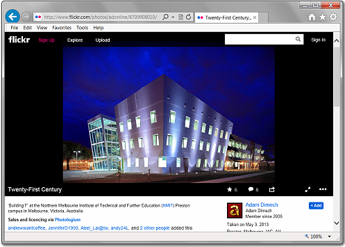
My other concern is navigation. There needs to be a “home” button. For instance, there’s no way to get back to the start of the app from photo pages or even this Photostream page:
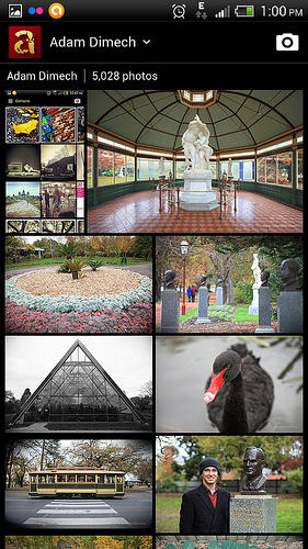
Pressing the ‘back’ button will sometimes work, but can involve a great many steps depending on what previous activities had been performed. This should be changed.
4. Maps
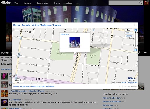
Back in 2012 I wrote that geotagging was a “half-finished idea” on Flickr. After I published that article, Flickr updated the maps and the resolution improved. Now, after just one year, the maps have been removed from photo pages altogether. This is a real pity.
Flickr users can still geotag their photos on a map, but now it is only the location that will appear on the photo page. One has to click the location in order to view a map. I would prefer that maps were reinstated in the space below the photos once again.
5. Collections
In March 2007, Flickr launched what it called “collections“. One could always pool images into “sets” but after this change people could gather related sets into collections. I always found this an especially useful feature.
Now it seems that collections have been depreciated. There is a prominent link to “Sets” at the top of each Photostream page, but “Collections” are relegated to a menu item. I’d prefer that the collections had the same prominence as sets, but am glad that the function has not been entirely removed.
6. Statistics
One of Flickr’s better features were the statistics, introduced to all Pro users in December 2007. Flickr have now announced that statistics are to be discontinued, except to legacy Pro members.
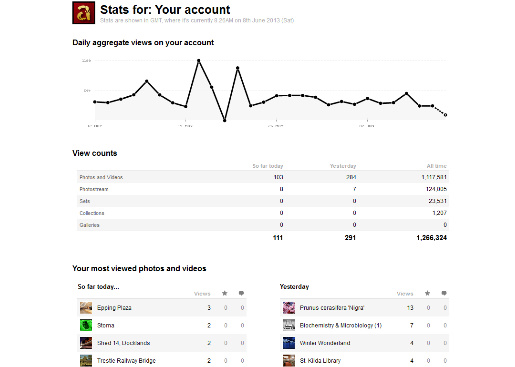
This isn’t a “make or break” issue for me, especially since I can keep access with my legacy Pro account but I believe this was an attractive feature that many people would have found useful (I certainly did).
7. Flickr’s Social Impact
One of the bigger issues for Flickr is whether these changes will stem the decline in the site’s market share of photo-sharing.
Flickr was once Number One in photo-sharing but rival platforms have since overtaken it, particularly Facebook and its former rival (now acquisition) Instagram. Instagram was perhaps the first platform to capitalise on the rise of smartphone photography and some have suggested that Flickr should have seen this coming. Like it or not, iPhones are now the most popular cameras on Flickr, even according to the Flickr site itself. (The most popular ‘real’ camera at present is the Canon EOS 5D Mark II). For everyday ‘happy snappers’, smartphones are the future.
Flickr’s strength has always been to appeal to both amateurs and pros, so smartphone photography is surely an important market. In more recent times, Flickr have recognised this with a new iPhone app and now the updated Android version, but is it too little, too late? Some have suggested that Facebook’s changes to Instagram’s terms of service will benefit Flickr, but I am less convinced. Nevertheless, the Flickr app will perhaps make the site more convenient for smartphone photographers in a market where convenience is everything for that user group.
That aside, there is some anecdotal evidence that Flickr is experiencing a resurgence. Photo blogger Thomas Hawk believes he’s spotted a 71% increase in photo uploads since implementation, no doubt aided by a television commercial. This is good news for those of us who wanted Yahoo to make Flickr awesome again.
I still maintain my argument from 2012 that Flickr’s social aspects need improvement. I still believe that Flickr needs Google Plus-style ‘circles’ and a better way of updating users about new uploads from users that utilises a Facebook-style algorithm that calculates what and whom a particular user is likely to be interested in based on past activity.
Flickr is facing more competition. Not only are Facebook and Google Plus working hard to improve their photo-sharing capabilities (with the added advantages of ‘social’ on the side), but other Flickr-style photo-sharing offerings are emerging, including 500px and ArtItBe. “The Internet” asked Yahoo CEO Marissa Meyer to make “Flickr Awesome Again” and according to them, she did.
We’ll just have to wait to see whether the changes pay off. For me at least, I am rather impressed and despite some niggles, I give the site a big thumbs-up.
Well done, Flickr!
Comments
One response to “The new-look Flickr: Pros and Cons”
Aaah your post has clarified about the Pro thing, I was confused too. I like the new layout, but it is harder to track comments and the like.