Brand Victoria
This week, the Premier of Victoria announced that a new brand identity had been created for the state to attract more tourists and business investment.
The Premier made the announcement this week, stating that “the Big V is back” and that the $20 million campaign would replace a patchwork of previous designs that had been used to date.
The new logo was designed by Ogilvy Australia and consists of a triangle with the word “Victoria” superimposed over the top. Only the letters “Vic” fit into the triangle. The main font used is Kessel 105 (Heavy) with support from Mark OT (Medium).
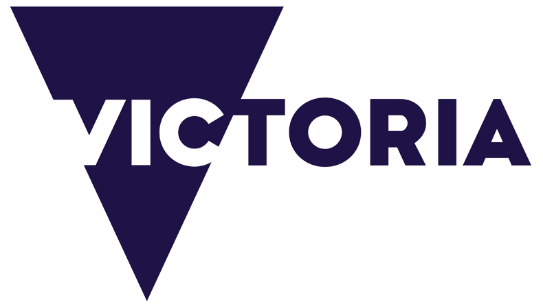
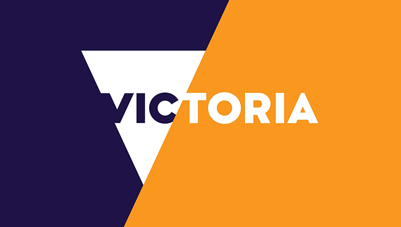
When used in context, the logo looks quite smart. Typically, it will be used with a range of colours behind it, or even images.
The new slogan that accompanies the logo is “Best of Everything”

As is always the case with new corporate identities, the new logo comes with a specific colour palette which is codified in a comprehensive set of guidelines. One of the logos that “Brand Victoria” will replace is the puzzle-pieces logo which has been used since 1993. According to Tourism Victoria:
Most tourism marketing symbolises a destination through its most popular icon – for example Queensland – sun; Sydney – harbour; Tasmania – green. Tourism Victoria’s research showed that no single icon adequately represented the State. Consumers described Victoria as a range of experiences and feelings.
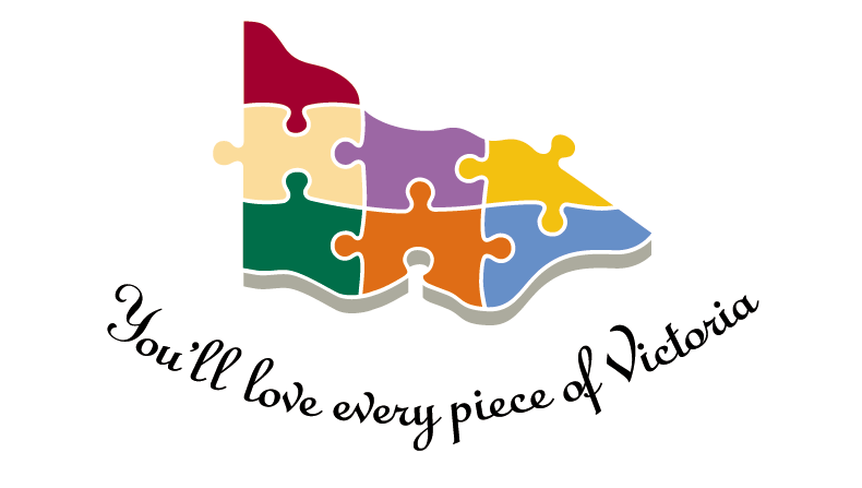
I always liked the puzzle logo and what it symbolised, but the Premier disagreed telling journalists
One of our logos was in fact a puzzle…Saying to the world that we are puzzled about ourselves… I don’t think that works.
Daniel Andrews, 12 August 2015
As one expects with these things, the new logo sparked some interstate rivalry from the Premier of New South Wales. Others felt that it referenced Tasmania. To me, the logo bears some resemblance to the London Victoria identity that was designed by SomeOne. One small business has already made a more serious claim.
What also seems likely is that the “Brand Victoria” will replace the current State Government logo, which was only updated a few months ago.
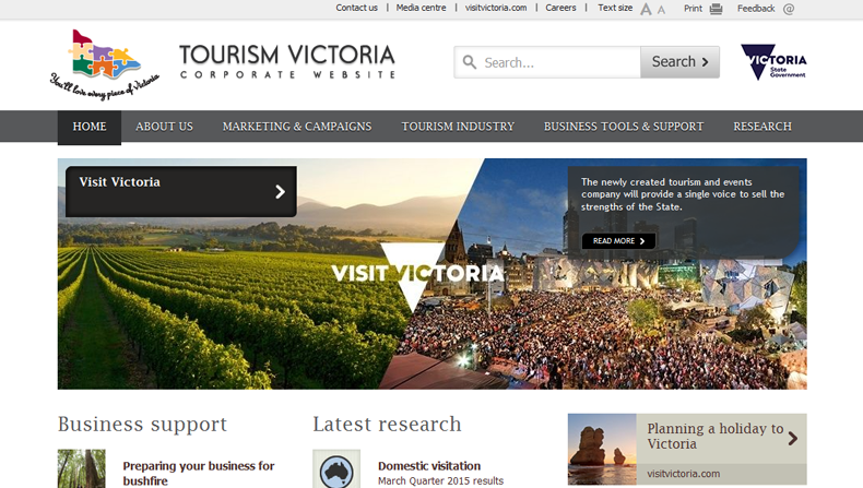
Evidence from the Tourism Victoria website supports this proposition. The current site exhibits the doomed puzzle logo plus a new State Government logo in the upper right-hand corner that appears to reflect “Brand Victoria”. The Department of Premier and Cabinet design guidelines also suggest that “Brand Victoria” will extend to all departments and agencies.
How departmental names will be worked into the design remains to be seen.
Disclaimer
These views are my own, and do not represent the views of my employer.
Comments
One response to “Brand Victoria”
I like the new logo, although I had never noticed the old. Victoria and Melbourne is a hard to sell against the glitz of Sydney and its weather. But, we do have really good coffee and Victorian era streetscapes.